
36 Bad Logo Designs As Shared By Folks In Twitter Thread Responding To Very Suggestive “Women’s Network” Logo
Logo design is deceptive. You’d think a tiny, quite minimal thing such as a logo would be easy to create using MS Paint—and while that is quite possible, if you have enough dedication to using simplistic tools—it is an entire science in and of itself.
Besides all of the artistic prowess and tools (and the skills to use those tools) you need to even start a logo design, there’s also things like significations and the meanings and the connotations and everything else that the logo represents explicitly and implicitly. And you gotta do all of it to have a significantly memorable logo.
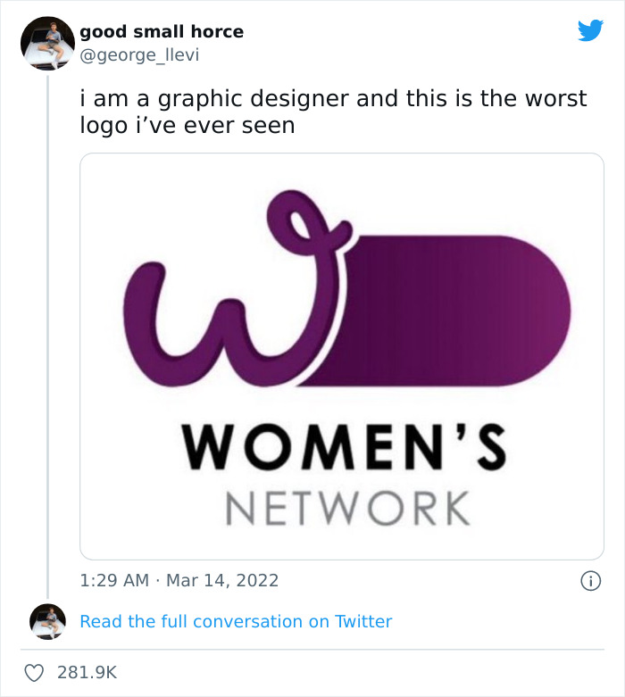
Image source: george_llevi
But there are also times when someone says “screw that” and creates a logo that causes an uproar. Like that one for the Women’s Network that, despite quite literally being dedicated to the concept of womanhood, has a huge symbol of masculinity kinda-sorta masked under it.
And graphic designers took note of it.
More Info: Twitter